Jane Saint Marie
A responsive design for an eCommerce business
Timeline
4 months in 2022
My Role
Research
UI
Prototype
User Testing
Project Type
School Project
Worked with real business
Background
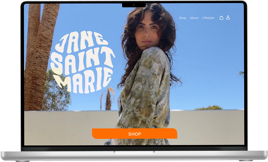
Jane Saint Marie is a small online boutique that primarily sold hand-dyed textiles on Instagram. The owner created her own website using a template platform. She was not satisfied with the aesthetic and shied away from referring customers to a site that did not represent her brand. I worked with the business owner to streamline her branding and design a responsive website during my coursework at Designlab.
Original Website
New and Improved Responsive Design

How We Got There
I kept in mind the business goals and constraints when going through the design process.
Goals
-
Responsive Design, Mobile First
-
Cohesive Branding
-
Research Current and Potential Users
-
Professional Site with Fun Feel
Constraints
-
No budget for professional photos
-
Site needs to be built in WiX platform
-
Very specific aesthetic/current Logo
Empathize
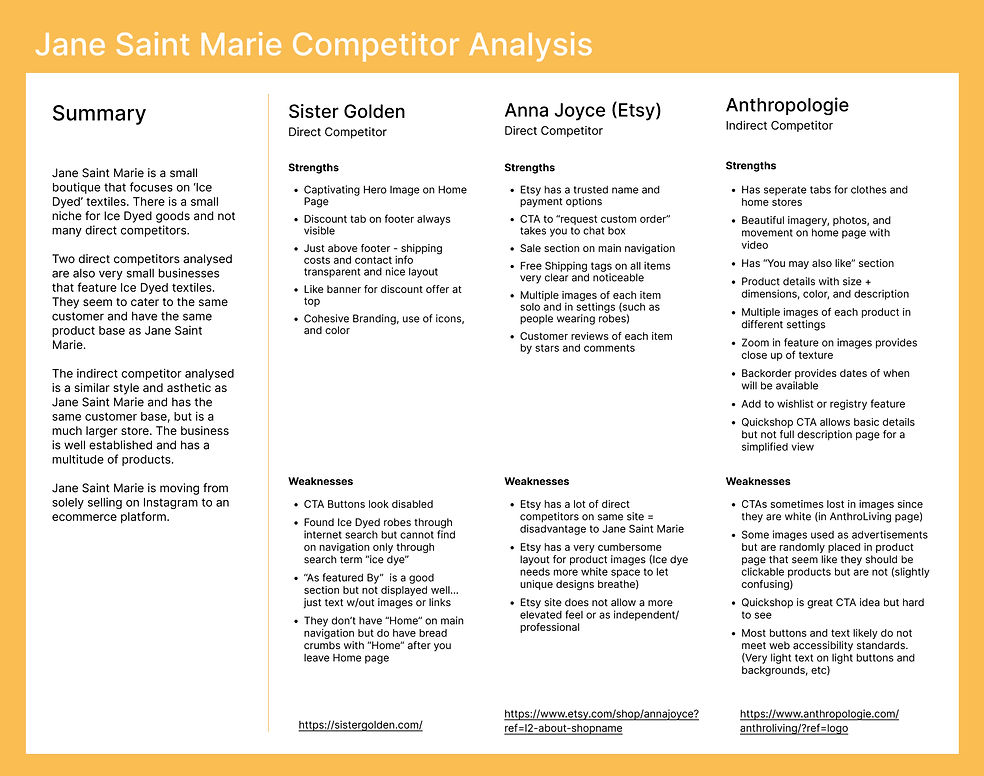
I started with a competitor analysis of other eCommerce sites that focus on Ice Dyed textiles since it is a niche product. I also included an indirect competitor, Anthropologie, because they have the same target audience as well as unique designers with different color selections for many textile items. The color selection of items for Jane Saint Marie is unique to other eCommerce sites due to multiple colors mixing for a watercolor effect and each item is unique since it is hand dyed.
Interview Debrief
Participants
4 female participants (1 In person, 3 via Zoom)
Ages 33-44
Frequent Online Shoppers
Like artsy products, small boutiques
2 Jane Saint Marie Customers
2 Potential Customers
Research Goal
To understand the online shopping experience frustrations and motivations, especially when shopping small boutique businesses online. We also wanted to get an understanding of peoples’ views on custom-order products, their concerns when ordering custom-made products, and what would make their custom-order experience better.
The Persona
After conducting user interviews with current Jane Saint Marie customers and potential customers, I created a Persona based on the personalities, likes, and dislikes of the interviewees.

Define
Site Map
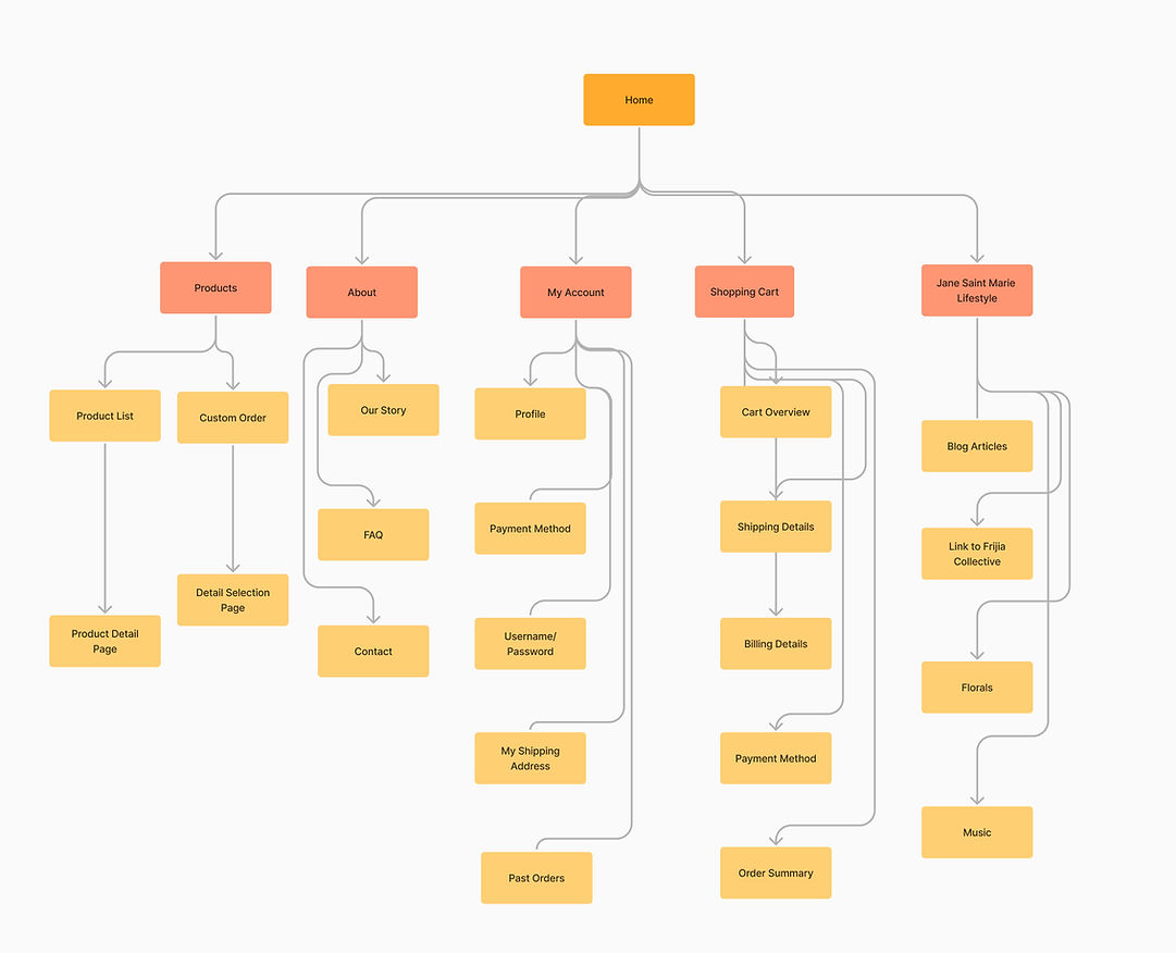
The site map focuses on a basic eCommerce site, but the added Lifestyle section suits the owner's desire to incorporate a blog and her other business ventures. The custom order CTA is also important for customers who have textiles they want custom dyed.
Wireframes
Based on research I conducted with Jane Saint Marie users and current website analytics, I designed mobile first with wireframes. Most Jane Saint Marie customers shop for products on the JSM Instagram page using their mobile phones or shop using clothing store apps. I focused on perfecting the mobile design and did responsive tablet and desktop designs secondly.
Ideate
Jane Saint Marie already had a very specific style and target audience. The owner was clear with her vision for branding. The logo for Jane Saint Marie was already designed by a graphic designer. My goal was to turn the style and branding into something more cohesive with a color palette and typeface that can be used in future design systems. This would enable the owner to manage her own site and other platforms with a solid branding system to pull from.
Heading 1 - Work Sans, Semi Bold
Subheadlines - Work Sans, Semi Bold
Body Text - Work Sans, Extra Light


I chose Work Sans for the typeface for three main reasons
1. It has a playful tone in line with the brand but it is still very readable and rates well by accessibility standards
2. It has a variety of font weights making it versatile for headlines, buttons, banners, and body text
3. It is a free Google Font which makes it easy for the owner of Jane Saint Marie to access over time and use on all of her platforms after the initial design to keep branding cohesive.
The orange color palette will attract attention which makes a good CTA. It also emits excitement and joy, it is a playful and fun color. I chose more of a monochromatic palette to not take away from the hand-dyed textiles and overwhelm the pages with too much color.
The buttons have a fun shape to add a little subtle character. The image format has a simple line border to add a modern, trendy look. Selecting photos was a challenge because the owner did not have a budget for professional photos. I selected the photos she had with the best lighting and highlighted the textiles. She will be able to insert new photos when she has the time and budget to change photos.
More of the UI Kit

First Prototype
Test
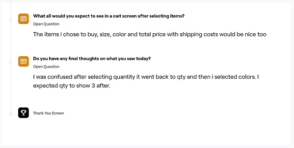
I used Maze for remote user testing and found valuable results.


Changes
Original Design:
Swipe up and down to see different CTAs (Shop, About, Lifestyle)


Original Design:
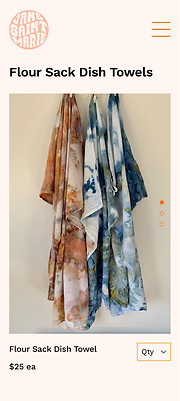
The product image carousel swiped up and down, this sometimes caused the entire page to scroll up not just flip the images.
Original Design:
The cart screen pop-up did not show the total cost and taxes of all items as a total cost. This would have happened on the next screen.

New Design:
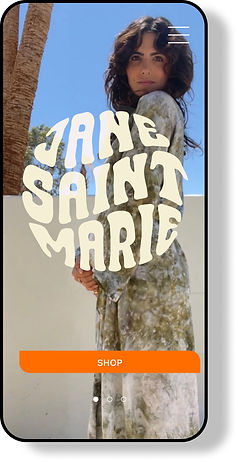
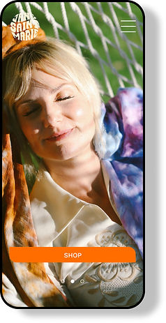
Swipe left to right. Shop CTA is the only CTA on the Landing Page as a sticky button, but pictures scroll. Multiple CTAs (for different actions) lose their effectiveness. Primary users will be on the site to shop. An about-page CTA does not really benefit the business since the about page is not a primary focus to take action.
New Design:
Changing the image carousel to swipe left to right eliminates the frustration of accidentally scrolling down the page. The right-to-left swipe was now consistent with the Landing page carousel changed also to swipe left to right-to-left.

New Design:
User interviews and validated during testing showed that shoppers found it helpful to see the total cost of all products added before proceeding to checkout.

Final Frames
Scroll horizontally to see all responsive layouts
Interactive Prototype
Try the final prototype below. Click the arrows in the top right corner to expand into a full screen.
Final Prototype
The Next Steps
The testing phase was valuable for minor changes that will make a big impact. Sometimes usability is in the smallest interactions that can frustrate or delight a user. Since this is a small business she will be maintaining the site on WIX platform. I am building the site for Jane Saint Marie based on these designs. Building on a website-building platform does have limitations, but I recommended WIX because it is extremely customizable. I will build the site and test it on the platform before handing over the design system and website for the owner to manage in the future.


